
GOOGLE VENTURE SPRINT FOR MOBILE APP
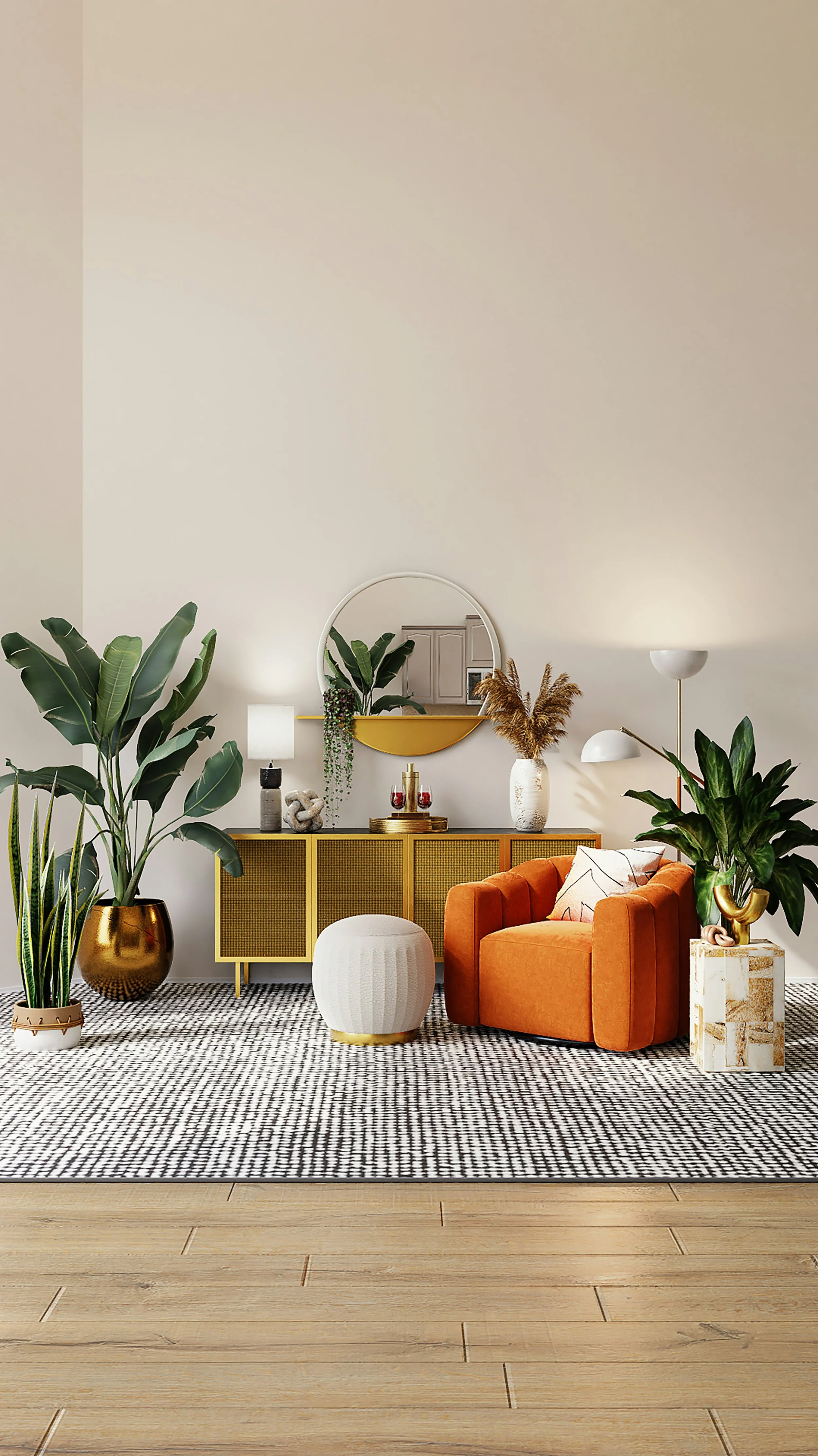
A home you can be sure to love.
HOUSE2HOME
House2Home is an ecommerce website looking to help people who have moved into a new home and want to buy a few new decorative pieces, but don’t know where to start.
Through surveys conducted by their team, their customer base is largely people who have just moved into a new space and need help deciding how to decorate it.
House2Home is interested in marketing pieces from 10-50 dollars and aims to find a solution for interior design that fits within their budget.
The challenge of this design sprint is to create a smooth interaction for users to try out pieces in their own space and purchase on the House2Home website.
CHALLENGE
We used a modified GV design-sprint approach to get insights and progress through risk evaluation, ideation, prototyping through human focused design approaches and testing using qualitative and quantitative data to reduce risk.
The goal of this sprint is to test the ease of adding to cart function after augmented reality (AR) has shown the object in their new space
GV design-sprint schedule (5 days):
Day 1- goal setting, evaluating risks, HMW questioning, user mapping, pick a target user
Day 2- existing competing product research, sketching potential solutions, crazy 8’s, and final solutions.
Day 3- final storyboard proposals and decisions
Day 4- digital prototyping and internal team testing
Day 5- interviewing users, monitoring a few tasks to complete and recording results
SOLUTION
Information gathering, competitor and project management and evaluation, and product design during all phases of the product’s development.
MY ROLE
TIMELINE
5 days
RESEARCH
User Maps

Competitive Research/Inspiration Research
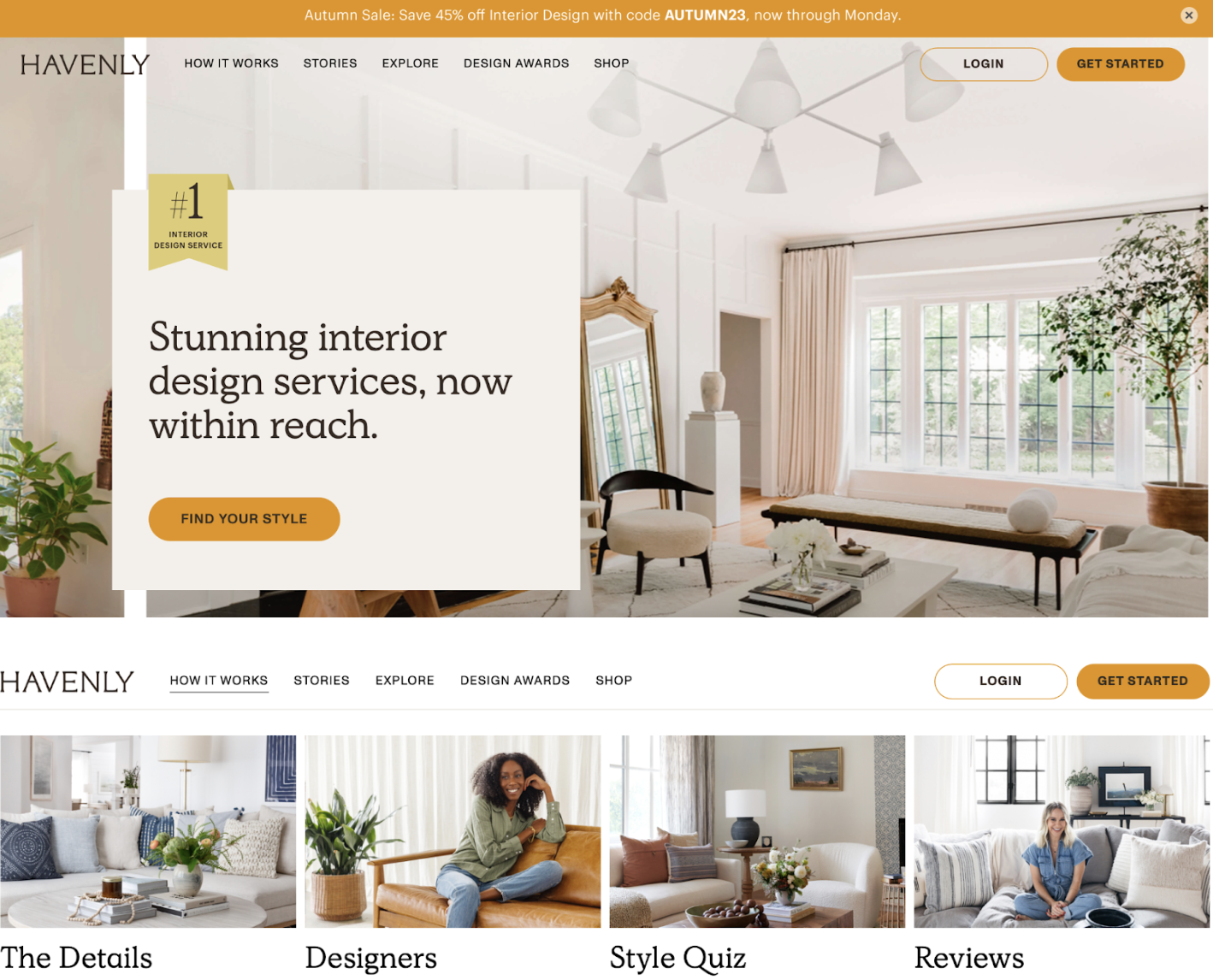
The site that was studied was an interior design site called Havenly. This site had a style quiz and asked questions about specific rooms the user was looking up focus on. The main issues with this site is that they require the user to sign up and create a profile to view progress further and view their results.
How Might We Questions
The most important HMQ questions will guide the further design process and decision making. These questions allowed us to think of ways to solve these problems in particular.
How might we encourage users that their design choice is good?
How might we encourage users to buy from our site after they have chosen an interior style they like?
How might we allow users to see their potential purchases in their space before buying?
Proposal of an online community that (3 main ideas):
Allows users to try out potential purchases with a photo of their own home
Allows users to add items to their cart easily after using them in AR
Allows users to try out multiple pieces at once with ease
IDEATE
Quick Iteration Sketches (Crazy 8’s)
Following the research and information gathering section, 8 quick and slightly varying solutions were drawn and proposed for the targeted focus area (adding an item to the user’s cart on the AR page). AR to adding-to-cart was determined as the main focus point to study as it was a possible solution to a House 2 Home’s user.

Following the research and information gathering section, 8 quick and slightly varying solutions were drawn and proposed for the targeted focus area (adding an item to the user’s cart on the AR page). AR to adding-to-cart was determined as the main focus point to study as it was a possible solution to a House 2 Home’s user.
Kristen stated:
“So many items look great in the staged photos - but will they look good in MY living room? You don’t really know until you order them and see how they look in the space.”

Storyboarding
Following the initial 3 panel creation of the testable task area, the rest of the quiz and shopping experience was determined. These panels were vital to see how the tested page would fit into the user experience as a whole.
8 panels were created to determine the flow and experience that would bring the user to our tested page.
The process was determined by looking at the inspiration site and walking through a series of questions to get to the tested page.

IMPLEMENT
Prototyping
Following the storyboard creation, the 8 pages were sketched out to a higher fidelity mockup using Figma as the primary prototyping tool.
Moderated Usability Testing Experience
Each interview/test (5 total) lasted around 10-15 minutes. As each user progressed, they were asked to complete 4 critical steps, the most important being adding an item to their cart on the AR page. Tests were conducted in-person over the course of three days.
Tasks to Complete:
Take quiz
Grant camera access
Add selected item to cart on AR page
Check cart for success
Valuable Quotes:
“I want to click on the text as well as the box to get where I need to go I guess.”
“Do we click on the arrow?”
“Scrolling between these options is easy.”
SUMMARY OF FINDINGS
Most users had a small amount of trouble navigating the quiz portion of the prototype, as there were only a few answers that could be selected during this initial test. Little to no direction was given on the AR page and no users had difficulty selecting the photo to add to cart. Some users wanted to retake the test with different results to see more style options (note that this should be made available for final prototype). All users were able to successfully navigate to the cart after adding an item on the AR page.
Outcomes and Lessons Learned
LESSONS LEARNED
Proper description of prototype state/status to interviewees is crucial. Users need to be made aware of the current stage of the prototype.
If multiple users have the same issue, it is a design flaw that needs to be adjusted accordingly and then retested.
Focusing heavily on one aspect of the prototype to test increased the likelihood that users will need targeted guidance in that particular area.
GOALS ACHIEVED
A working prototype to a solvable issue was developed and tested on multiple users, providing the end result with a successful pathway forward and specific actions to take to improve the prototype’s tested feature.